

La Familia es la Fundación
Children, Change and the Reproduction of the House and Family among the Kaqchikel Maya
The Context
Exploring kinship structure in a changing social context
For my senior thesis at Carleton College, I completed independent, ethnographic field research in Santa Catarina Palopó, focusing on the changing role of children in Kaqchikel Maya kinship structure.
Mapping the patient experience
At the core of NEAT-O is its evidence-based curriculum broken into a series of learning modules for patients. But the app and its role in patients’ recovery process beyond this curriculum is still fairly undefined. So my team and I were tasked with mapping out a strategy and structure for a proposed patient experience using the app.
Based on our research into the landscape of existing apps to support patients with substance use disorders, my team and I crafted an overarching strategy and 3 key patient touchpoints, which we prototyped to propose a structure for patient interactions with the app.
Role
UX Designer
Dates
July 1-3, 2024
Teammates
Nancy Dabla & Becca Steinke
Methods & Tools
Stakeholder interview, secondary research, strategy & guiding principles, experience strategy map, annotated wireframes, interactive digital prototyping, Figma, Zoom
The Problem
Exploring a relatively new field
Prescription mobile apps are a fairly new concept, especially in treating substance abuse disorders. By focusing in on a cognitive behavioral therapy approach to treating co-occurring opioid use disorder and anxiety/mood disorders, NEAT-O is paving the way in the field. But as a result, there are few examples to follow when creating the patient experience.
To address this issue, Anker/Rienhart Labs asked us to design and propose a patient strategy and structure for the NEAT-O app.
Our initial process of mapping the patient experience
The Research
Exploring the competitive landscape
To understand the market and patient context for the NEAT-O app, my team and I started by conducting secondary research, digging into the plans for the app itself, the research about treating medical conditions with prescription mobile apps, and patient responses to existing similar apps.
I focused on patient reviews of existing apps, noting:
what the apps provided
frameworks and touchpoints
patient pain points
what patients liked
Some of my notes from patient reviews of similar apps
Key research findings
In our research, we found that similar prescription apps—along with other apps to support individuals with substance use disorders—showed both impressive empirical results and patient reviews. We noted particular patterns that impacted these apps’ success:
What patients liked:
Visualization of their health data and progress
Gamification, along with positive reinforcement through rewards and incentives to encourage continued engagement
Empowerment through learned knowledge and skill-building
Community building and easy access to real people with lived experience for support
Patient pain points and challenges:
Usability issues, bugs, and other technical or design flaws
Broken promises—patients lost trust when the apps did not do what they said they would (e.g. unclear, unfair, or missing incentive payments; inaccurate sobriety tracking)
Accessibility issues, including the non-universal nature of a mobile app
Overall, we found that these apps were largely successful when they did what they said they would do, but if an app ever appeared unreliable, patients showed an immediate loss of trust and stopped using the app altogether. So we determined that as a baseline in the app’s implementation, reliability was key.
Synthesizing our research to find key themes
The Strategy
Building a patient experience strategy
Based on our research findings, my team and I crafted a strategy statement and focused in on some guiding principles to structure our proposed designs for NEAT-O.
Strategy statement:
All patient touchpoints for NEAT-O will help adults diagnosed with OUD and concurrent anxiety and mood disorders to feel empowered and supported so that they are able to meet their recovery goals. We will do this by focusing on easy-to-navigate education, a safe environment, and motivational progress tracking.
Guiding principles:
Ensuring patient privacy and reliable app functioning establishes trust.
Patients thrive with community support in a non-judgmental and non-stigmatized environment.
Patients are more likely to use an app that is easy to use, intuitive, and accessible.
Learning about themselves and the science around how their brains work empowers patients to build a toolkit of coping mechanisms to handle cravings, triggers, and emotions in a healthier way.
NEAT-O is a companion tool for a patient’s recovery journey, not a cure.
Mapping patients’ pathway with NEAT-O
Using this strategy and guiding principles, we created a patient experience strategy map (see below) outlining patients’ touchpoints with the app and how it would fit into their overall recovery journey.

Touchpoints for NEAT-O as a daily companion app
Rather than imagining a linear pathway for patients, we designed a circular pathway within the app, in which patients would return daily to complete learning modules, gradually increasing their knowledge and coping skills and tracking their recovery progress.
We identified and built out prototypes for 3 key touchpoints in this pathway:
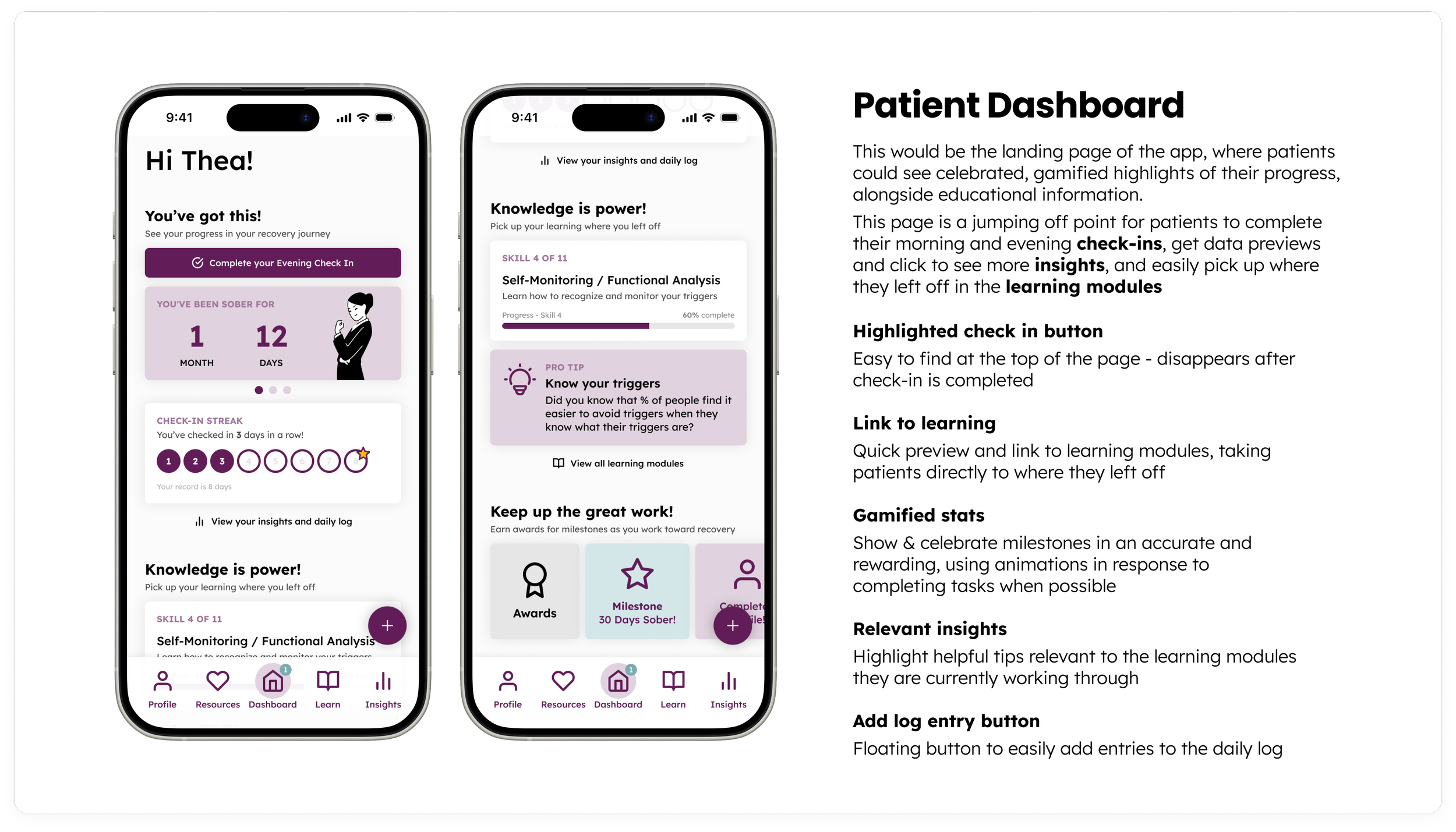
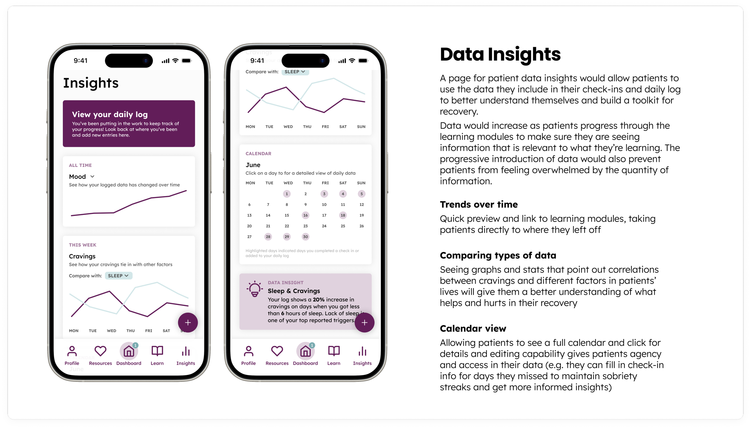
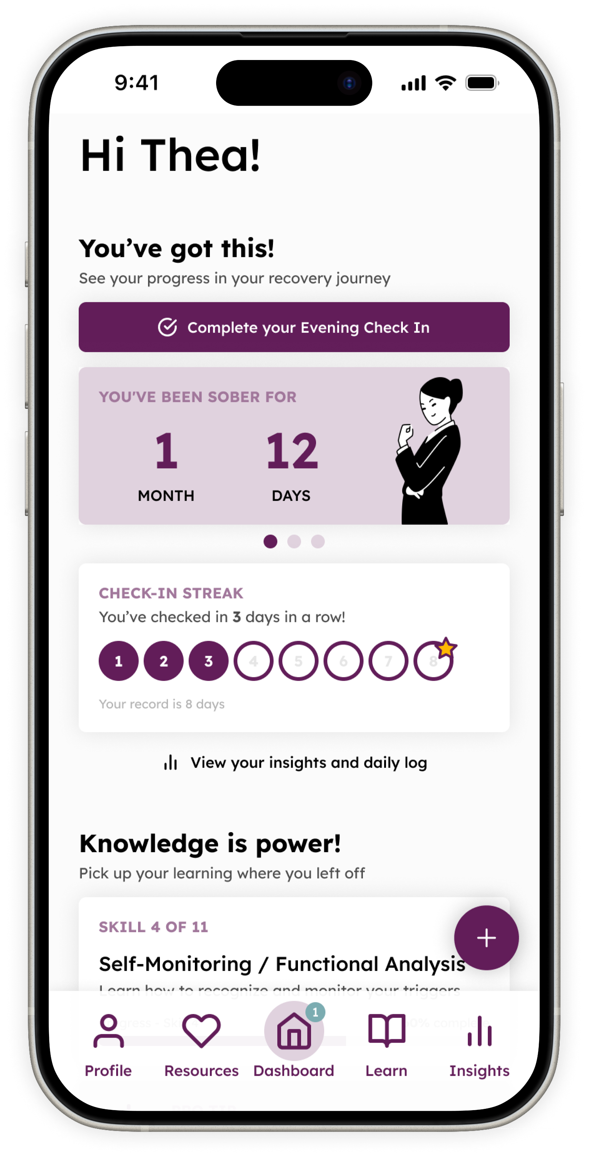
Dashboard & Insights - a landing page and more in-depth data page on the app where patients would be able to complete daily check-ins, see their recovery milestones, see visual representations of their data, and easily pick up their learning from wherever they left off (See my annotated wireframes for these touchpoints [also included below] or check out my interactive prototype for these features)
Learning modules - an ordered collection of interactive lessons to help patients learn about themselves, track and understand data related to their use and cravings, and build a toolkit of healthy coping mechanisms (see my teammate Becca’s annotated wireframes for the learning modules)
Notifications - A system of push and in-app notifications to encourage mindfulness, celebrate achievements, facilitate learning, promote self-assessment, and provide a personalized experience for patients (see my teammate Nancy’s notifications storyboard)
The Design
Building a patient dashboard as the main landing page and jumping-off point
For my role in the design, I focused in on the patient dashboard—the “home” page in the app where patients could see snippets of key information and easily link off to more in-depth views. I also built out what the insights page could look like, where patients would be able to explore in-depth data they had been tracking to understand their progress and see patterns and barriers in their recovery.
The annotated wireframes below show my designs for these pages and outline some of the reasons for various features. But my overall goals in these designs were:
A positive, non-judgmental, encouraging tone
An appealing design with gamified features to keep patients motivated to continue engaging with the app and working toward their goals
Easy access to learning modules and insights pages
An insights and recommendations framework that gives agency to patients, empowering them to be experts in their own data and to be accountable to staying on track and implementing what they learn
Fitting into the larger strategy and framework
My design for NEAT-O’s dashboard and insights page was intentionally created to fit into the larger framework of touchpoints my team and I identified.
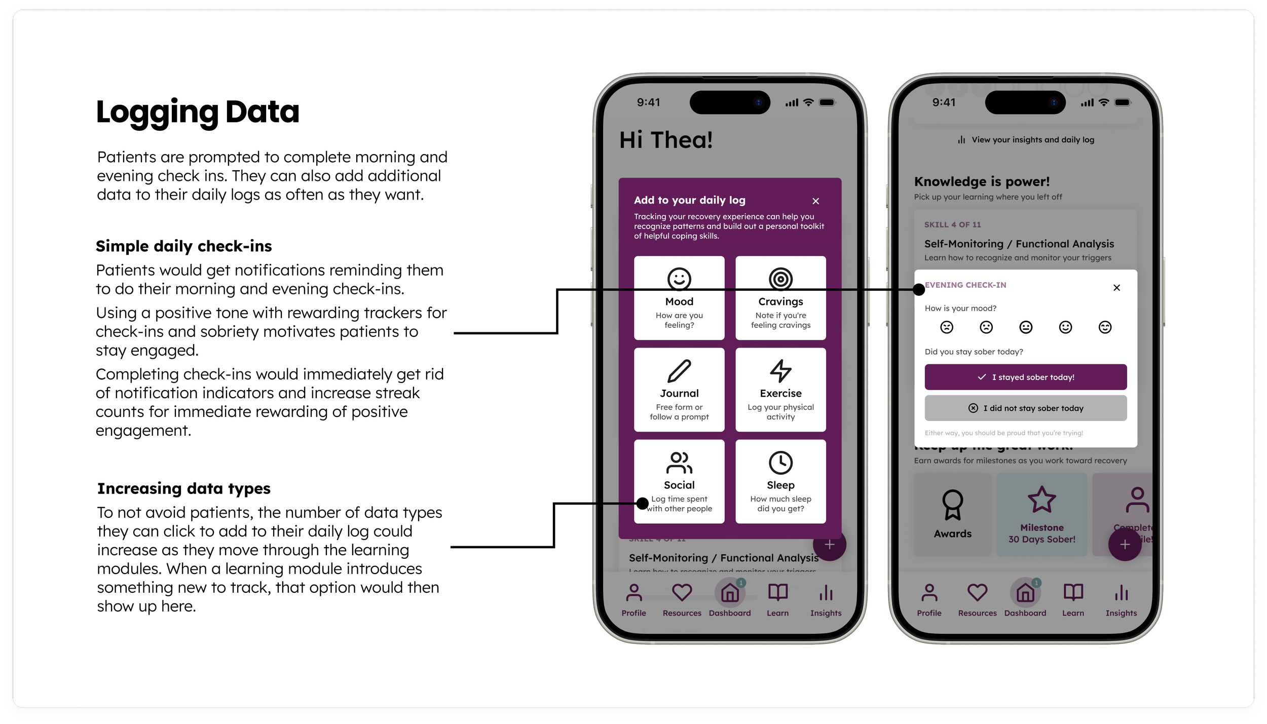
The dashboard would direct patients to continue their learning on the learning modules page, and the insights and daily log options would expand as the patients worked their way through the curriculum so as not to overwhelm them from the start. Different types of data tracking would slowly be added to dashboard and insights as these concepts were introduced in the learning modules.
The notifications would direct patients to the dashboard and celebrate milestones and progress shown on the dashboard and insights page. The notifications would also remind patients to complete their daily check-ins and log data that would feed into what was displayed on these pages.
Snippets of my teammates’ prototypes for the learning modules and notifications structure of the app are included below:
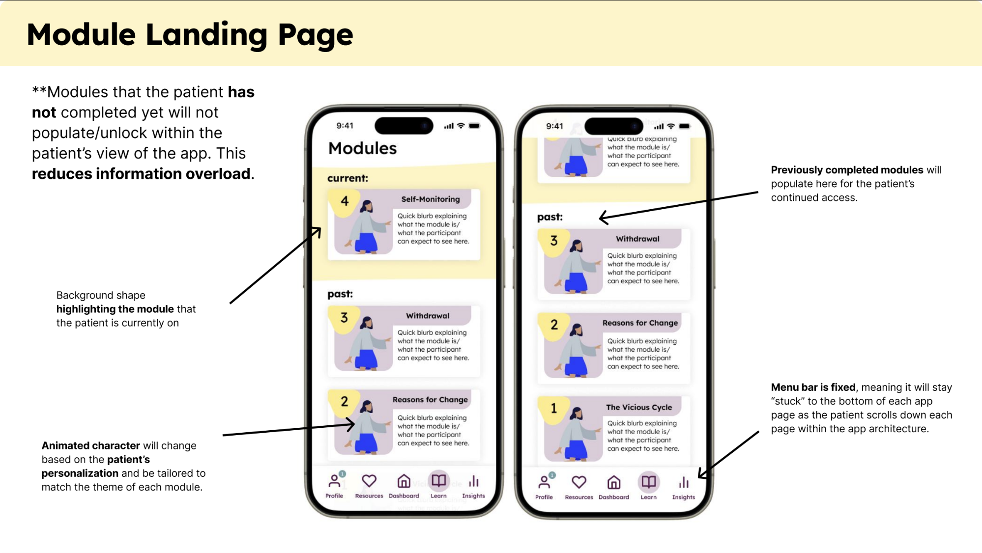
Becca's annotated wireframe for the learning modules landing page
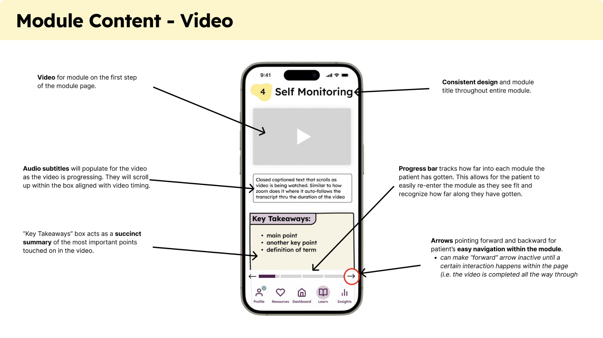
Becca's annotated wireframe for learning module video content
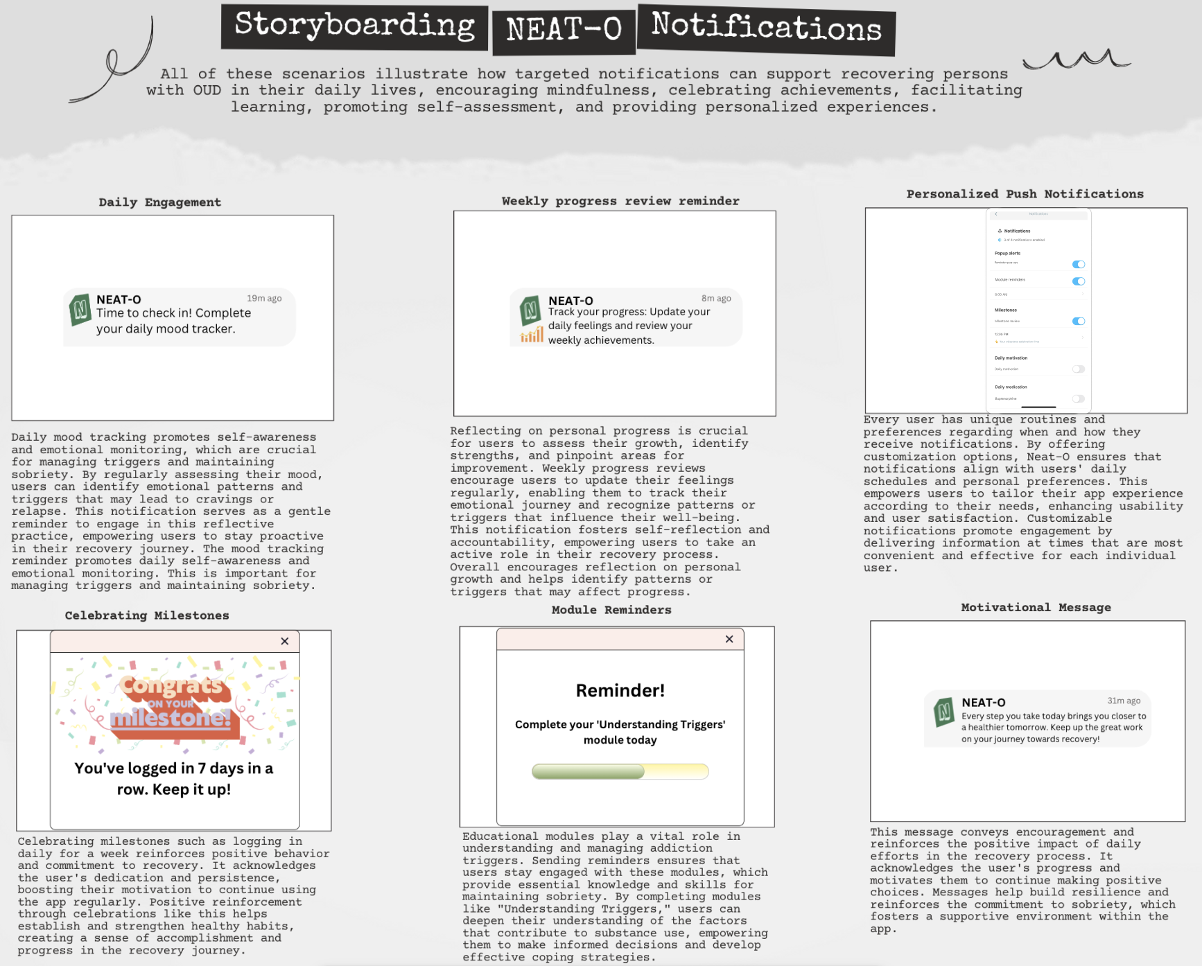
Nancy's annotated storyboard of push and in-app notifications to keep patients engaged and celebrate their progress
Next Steps
Aligning with stakeholders for future development
Given the constraints of this project, my team and I were only able to touch base with the app’s creators from Anker/Rinehart Lab at the beginning of our work. And since there were few existing design plans for the app beyond its curriculum when started, I would be interested in meeting with stakeholders again now that we have submitted our recommended strategy and framework for NEAT-O to make sure our team’s ideas are fully aligned with the creators’ vision for the app and that the ideas are within the capacity and scope of the app builders and designers contracting with Anker/Rinehart Lab.
It would be helpful to discuss stakeholders’ reactions to our recommendations and consider next steps in moving forward with a strategy.
Considering additional features and specific designs
Since the scope of our project was more focused on the overall strategy of how the app would fit into patients’ recovery process, I would be excited to work with Anker/Rinehard Lab in creating more concrete designs for the app.
Some focus areas to consider:
Language & tone - these aspects of the app will be important in establishing patient trust and motivating them to stay engaged. All language should be non-judgmental, and the overall tone should be positive and encouraging, while encouraging patients’ accountability in their recovery process. But striking this balance is not a straightforward task (e.g. considering how to frame asking patients whether they have stayed sober on a given day). User research would be key in establishing language and tone that are most conducive to patients’ continuing engagement and success.
Simplicity and intuitiveness - Our designs focused more on strategy than on UI, so they are likely more “busy” with content than might be ideal. There should be particular attention paid to making the app as easy and intuitive to use as possible to ensure it is accessible and avoids confusion.
Customization - Especially given the number of notification options we are proposing, having significant customization options for notifications (e.g. timing, which notifications patients want and how they want them delivered) will be important to give patients agency in how they interact with the app. An unchangeable misalignment of the app’s design with patients’ needs might cause them to disengage.
Data tracking structure - the current curriculum for the learning modules includes a large amount of data tracking, which may make sense within a particular lesson, but it assumes that patients will be tracking all of this data outside of the learning module as well (and that this data will be displayed in understandable ways on the insights page). This amount of data tracking can get very complicated and overwhelming for patients very quickly. The app makers should really think through what they want this data tracking structure to look like, since it's a core feature of the app (e.g. do they want patients tracking every metric from the start, or do they want metrics to be introduced in the app as patients move through the learning modules? Introducing metrics too early could lead to overwhelm, while introducing them too late could compromise the quantity and quality of the data. Which metrics should be prompted in patients’ daily check-ins vs. available as options for them to log when they want?)
Community support - in our research, we found that community support was the most valued feature in many patients’ reviews of similar apps. This could take the form of a dedicated “coach” patients could chat with and/or opportunities to connect to other sober people with lived experience of addiction through a social network or online meetings. This essential aspect of community connection is currently absent from NEAT-O’s plans. My team and I considered making the “Resources” tab into a “Community” tab instead for this reason. I’m not sure what this feature should look like, but it is important to bring in some kind of community connection—especially since this therapy-based app is removing the human aspect normally included in therapy.
Dashboard & insights interactive prototype